Showing posts with label nibmeister Yamada. Show all posts

10 January 2020

2-Fold Nibs

I cannot say for sure that it was Nibmeister Nobuyoshi Nagahara's idea on the first place, but certainly it was him who popularized the idea of two- and three-folded nibs with the support of Sailor.

Some early examples by him date back to the 1990s, as were reported on these pages.


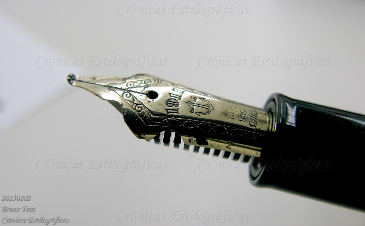
An early Cross nib by Nobuyoshi Nagahara.

Those initial nibs later evolved into what we know today—open nibs with or without overfeed that made their way to the catalog of the brand and to commercial success.


Three generations of Cross nibs.

Then some nibmeisters copied this idea. Wagner-resident Yamada used Pelikan M800 as the base for his version.


Yamada's approach to a 2-fold nib-two overlapping Pelikan M800 nibs.

Wagner member Mr. Mochizuki, on his side, used a much more affordable canvas—a Chinese pen available at the 100-yen chain shop Daiso.


Mochizuki's approach based on a Daiso pen. A steel 2-fold nib.

Only recently, in the last couple of years, non-Japanese nibmeisters have attempted these two-fold nibs. The most brilliant of them, dare I say, is nib wizard Ralph Reyes of Regalia Writing Labs with his continuous development of old and new ideas. The nib here shows is a nice example of this—it is a cross-concord nib, in Sailor terms, with an overfeed; but the overfeed is made out of a third nib and is nicely integrated on the unit.


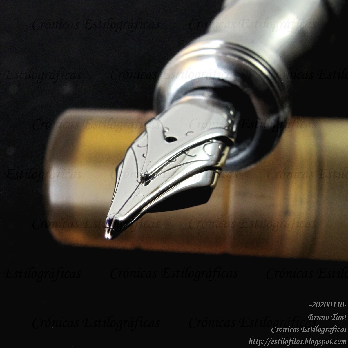
A 2-foold nib by Ralph Reyes based on JoWo #6 nibs.


My thanks to Inky.Rocks.


NOTE (16/January/2020): Writng samples of some of those nibs can be seen on the following Chronicle: https://estilofilos.blogspot.com/2020/01/2-fold-nibs-writing-samples.html


Opus 88 Koloro #6 – De Atramentis Beethoven

Bruno Taut
Shinjuku, January 10th, 2020
etiquetas: Sailor, nibmeister Nobuyoshi Nagahara, Nibmeister Yamada, nibmeister Ralph Reyes, plumín, Mr. Mochizuki

07 July 2013

Pelikan 1600

What single writing tool could produce ALL the lines shown on the following picture?


All the strokes were done with the same writing tool. It was not modified at all during the writing process (barely 20 seconds). The height of the capital P on Pelikan is 16 mm. The width of the underlining stroke, under the word "all", is between 7 and 8 mm.

This is an old topic on these Chronicles—that of nibmeister Yamada’s creations. But the previous picture does show the amazing versatility of the oppose nib scheme devised by nibmeister Yamada, implemented in a Pelikan M800. It also explains and justifies these radical attempts to understand nibs.

The answer to the initial question can be seen on the following pictures. The name Pelikan 1600, as he likes to call it, derives from the use of two Pelikan 800 nibs.


There is, however, another answer to that question: a traditional brush.

More information can be found on the following Chronicles: Innovation (I); Innovation (II); and Innovation (III). Analysis.

My thanks and my admiration go to Mr. Yamada.


Pilot in stainless steel (1968) – Pilot Blue-Black

Bruno Taut
Yokohama, July 7th 2013
etiquetas: Pelikan, nibmeister Yamada, soluciones técnicas

02 February 2013

On Gold and Steel

This is, lately, a recurrent topic of discussion: how important is to have a gold nib? What are the differences in performance between those materials? These are my experiences, my conclusions, and also my doubts.

1. Nib flexibility is more a matter of its geometry than of the material it was made of. To illustrate this point, I am including two pictures. First, a Pilot’s steel nib from the 1950s with remarkable flexibility.


Second, a very rigid modern Sailor nib modified by nibmeister Yamada to make it flexible. Needless to say, Mr. Yamada did not change the composition of the nib but just its shape.


2. Now, in the case of two identically shaped nibs, the one made of 14 K gold is more flexible than that of steel. But higher gold content does not make the nib more flexible. In fact, higher gold content makes the material more prone to plastic deformation. Therefore, high grade gold nibs –21 K and up— must be very rigid to avoid deformations.

Nothing can I say about the flexibility of poorer, below the usual 14 K, gold alloys. Those, in any event, are rare in the pen industry.


On top, a 22 K gold nib by Platinum. On bottom, a 23 K nib by Sailor. Both are very rigid.

3. The raison d’être of gold nibs is, over any other consideration, its very high resistance to corrosion. But with modern inks and correct pen hygiene nib corrosion is a very minor risk despite what some ink producers might claim. Consequently, the wish, or the need, to implement a gold nib is mostly a matter of marketing over any practical justification.

4. Writing smoothness has nothing to do with the nib material. The contact point between pen and paper is the iridium point (no longer made of this metal), and the smoothness of that contact point lays on the tipping material and on the quality of the polishing.

5. Having said that, I also want to add a caveat. In my experience, gold nibs tend to run a tad wetter that their steel counterparts. The reason for this might be related to differences in the interactions of the ink with the different nib materials. More ink, then, means more lubrication on the tip and a smoother writing experience. But this factor is secondary to the quality of the polishing or to the characteristics of ink and paper, and it could easily be corrected with an adequate design of the feed.

6. Finally, we should never forget that the writing experience depends on the pen, on the ink, and on the paper. And on our way of writing.

Morison pocket pen, 18 K nib – Sailor Jentle Black

Bruno Taut
Yokohama, February 2013
etiquetas: soluciones técnicas, mercado, plumín, Sailor, Pilot, Platinum, Yamada

14 November 2012

Reminder

Long time ago, at the beginning of this blog, I wrote a text vindicating the role of the nib –and of the feed—over the rest of the pen. A fountain pen, I wrote in Spanish, was a system to control the flow of a fluid on its way between a deposit and the paper. And therefore, materials, colors, filling systems, shapes are secondary as long as they created no problem in the act of writing.

However, current commercial trends seem to be focused on these secondary elements, and pen companies indeed charge a lot for those. Precious resins, colorful celluloid, exotic lacquers, intricate ornaments, rare wood, new materials, … revival of pneumatic filling systems, pistons, plungers, eyedroppers… The business of new fountain pens is no longer based on the utility or on the need to write. Fountain pens are a commodity, a symbol of status, a sign of snobbism. And craving over need determines what we, users and collectors, end up buying.

But some people do not want to forget that fountain pens are writing tools. And that is why people like Yamada or Nagahara and those many masters in adjusting a nib are so necessary.

Pilot Elite pocket pen, posting nib – Pilot Blue

Bruno Taut
Shinjuku, November 9th, 2012
labels: plumín, Mercado, estilofilia, Yamada, Sailor

04 November 2012

Fude Matsuri

Nibmeister Yamada is already well known to the readers of these pages. His innovative approach to nibs and his impressive skills to manipulate them are always sources of amazement.

At the last Fuente meeting in Tokyo (October 27 and 28) he showed the latest modifications he had made for some friends. It was indeed a festival of fude nibs. First, he showed a Visconti Opera, a Twsbi Diamond 540, and a Twsbi Micarta 805 with their nibs modified.


The Visconti Opera with its 14 K gold nib.


The Twsbi Diamond 540's steel nib.


The steel nib of a Twsbi Micarta 805.


All three modified nibs together for comparison.

Later, on the spot, he modified the generic nib of a Lapita Lemon—a mostly uneventful pen sold together with the now discontinued magazine Lapita in 2005.


The Lapita Lemon pen...


...and the writing test with orange ink.

And the very rigid nibs became something more exciting. Hats off, please.

Pilot Custom Heritage 91, SFM nib – Diamine Teal

Bruno Taut
Yokohama, November 3rd, 2012
labels: plumín, Yamada, evento, Visconti, Twsbi, Lapita

15 June 2012

Innovation (III). Analysis

We recently saw how nibmeister Yamada managed to turn the screw of the nib a little bit more. Opposing two nibs does indeed surprise whoever saw them, as has been reflected on some fora. What is the point of such an experiment, many ask.

Actually, two nibs, four tines, two feeds offer a huge field for experiments, and the final performance depends on the configuration of all those elements. Beyond my first approach –asymmetric vs. symmetric nib sets— there is room for a more careful analysis.

A basic feature of these nibs is their capability to change the line width. In some cases, in a very drastic way —either a fine line or a wide-as-a-brush line; in some other, the change can be more progressive and it depends mostly on the angle between pen and paper. But there is a lot more.

The different curvatures in the nib sets allow for different line widths. On the Senator, top pen, the change between a thin and a very thick lines is more progressive than on the Pelikan on the bottom.

Asymmetric sets, with one of the nibs basically untouched, preserve the possible flexibility of the upper nib. Then, the effect of pressing the pen on the paper is more complex: lifting the upper tip uncovers that of the second, lower, nib, and this one provides its own supply of ink. So, the thicker line does not rely on just one feed but on both of them, and the whole set is less prone to ink starvation.

On more symmetric structures, with both nibs bended, the whole set becomes fairly rigid. This was in fact the purpose of one of Mr. Yamada’s creations—a fountain pen for a user who tended to push the pen down a lot when writing. In a sense, this idea is not new, and nibs under the name of script or manifold or posting were successful to provide a rigid tool to be used with carbon paper.

A very rigid nib set.

On these symmetric sets, the final configuration of the nib points can also favor the use of the pen at non-conventional angles. Or, at least, with the nib rotated about 90 degrees with respect to the natural position. At this angle there are two half-spheres of iridium, belonging to two different nibs, and both with ink ready. At this writing angle, the set is very rigid. This characteristic, though, is not limited to symmetric nibs and asymmetric units can also write at non-conventional angles.

A nib set suitable to be used at unconventional angles. Note the symmetric tip.

Symmetric sets allow for writing with the tip, of course, and with both slits. The later lays fairly broad lines.

An asymmetric nib, in a Senator pen, writing sidewise.

Conclusion: In the aim of creating nibs with several line widths, the Mr. Yamada’s idea of opposing two nibs offers new variables and degrees of freedom. The whole nib has now two feeds and two slits, and each nib-feed set works very independently from the other until the point in which both tips come together.

My thanks to Mrs. Arai and to Mr. Yamada.

Pilot Capless 1998 model, 18 K gold F nibSailor Sei-boku 青墨

Bruno Taut
May 31th, 2012
etiquetas: soluciones técnicas, plumín, Yamada

05 June 2012

Innovation (II)

The obvious alternative to the asymmetric configuration of the opposed nibs is bending both nibs in a similar fashion. However simple this might look, the devil –as usual— is in the details. How do both tips interact? But that will be the topic of another chronicle.

Three Pelikan pens with symmetrically opposed nibs. Note the differences in the feeds.

Asymmetric vs. symmetric.

Suffice to say now that this configuration tends to make more rigid nibs. A perfect example if this is this Pelikan M200, albeit equipped with two Chinese-made nibs.

The very rigid creation by Mr. Yamada.

The goal was to create a very rigid and very resistant nib for a user who applied a lot of pressure when writing. The owner was truly happy with the final result of Yamada’s inventive mind.

The tip of the nib, we can see on this picture, is not symmetric. There is an upper nib and a lower nib, marked with the yellow sticker, as could be seen on the previous picture.

My thanks to Mrs. Arai and to Mr. Yamada.


Pilot Capless 1998 – Sailor Sei-boku

Bruno Taut
June 2nd, 2012
etiquetas: Yamada, plumín, evento, soluciones técnicas, Pelikan

30 May 2012

Mackintosh

Blogs and fora and other Internet media are now re-broadcasting the news originally released by the BBC on the increasing popularity of fountain pens. Sure enough, we stylophiles should be happy about it: more sales would certainly turn into more attention on the side of the companies and more models in the market. All in all, more excitement for us.

Another of Yamada's creations.

However, what is the business model for most of those companies? BBC quoted the views of Gordon Scott, vice-president for office products at Parker pens in Europe, the Middle East and Asia. He claims that buyers of new fountain pens, for whom they are more an accessory than a tool, look for a traditional element on them: "People want the memory of a fountain pen in a contemporary pen." This might explain, incidentally, why Parker launched the moral fraud of a felt-tip pen by the name of Ingenuity with all the fanfare.

But in this context of the pen as a retro-looking accessory –I spoke in terms of status symbol for the paradigmatic case of Montblanc— the nib is an even more secondary accessory. And few demands would be placed on them other than being made of gold, I am afraid.

Yamada and Nagahara, face to face.

So, innovations like those by the Nagahara family or nibmeister Yamada, give us some more solid hopes for an interesting future in the world of fountain pens. Otherwise, most of the well-established companies would engage in an endless and empty exercise of style, in a mannerist activity, in an inane recreation of archaic tools.

Charles R. Mackintosh said it with elegant words: “There is hope in honest error. None in the icy perfections of the mere stylist”.

Sailor black pocket pen with inlaid nib – Wagner red-black

Bruno Taut
May 29th, 2012
etiquetas: estética, mercado, soluciones técnicas, Yamada, Sailor

27 May 2012

Innovation (I)

Sailor’s specialty nibs, I have said on these chronicles, are arguably the most interesting innovation in fountain pens in recent years. The idea of overlapping two and three nibs is both elegant and efficient.

And on these texts, I have also mentioned the amazing creations of nibmeister Yamada. Among them, his version of a two-fold nib, based on a Pelikan M800, caught the attention of many of us.

Then, what’s next? Are there more possibilities in our understanding of nibs and pens? Mr. Yamada is indeed creative and daring. And so his question was more concrete, more advanced: What if instead of overlapping the nibs we opposed them?

A Senator (top) and a Pelikan 800 with opposed nibs.

Senator (left) and Pelikan (right) nibs. Their geometry are different.

Here we have a couple of average looking pens: a Senator and a Pelikan (M800). Their nibs, though, have been heavily modified and now are unique and radical. Mr. Yamada did really oppose two nibs, and to do so he had to make special feeds to provide ink to both of them.

These nib sets have the wonderful property of allowing a big number of different strokes, which in turn depend on the geometry and configuration. Needless to say, now there are many more possibilities. Today, I will only speak about the asymmetric configuration.

On the Senator pen, the lower nib, on the right in the picture, is made of steel. Its bending is quite progressive.

The Senator pen in the hands of its creator, Mr. Yamada. Please, note the variety of lines.

On it, one of the nibs is mostly untouched and the other is bended about 45 degrees in a quite sharp angle. The result is a wet fine point —fed by two slits— when writing with the tip. At more shallow angles, though, the whole lower nib draws a very thick line.

The Pelikan set is formed by two 18 K Pelikan nibs. The lower nib is bended at a much sharper angle than that of the Senator pen.

The nib set, as in any Pelikan pen, can easily be detached from the section. On the paper, some writing samples of the Pelikan nib. Note the possibility of drawing both thin and very broad lines.

Indeed a versatile nib with lines ranging from very fine to inordinately broad.

On another chronicle I will describe other possibilities.

Hats off to Mr. Yamada!


Pilot Capless 1998 – Sailor Sei-boku

Bruno Taut
May 23-26, 2012
etiquetas: Yamada, plumín, evento, soluciones técnicas, Pelikan, Senator.

21 September 2011

Sailor´s Paradox

I have already complained on these Chronicles on the difficulties, on modern Japanese pens, to find interesting nibs combined with self-filling systems other than the boring –albeit convenient— cartridge-converter scheme.

The "Mannenhitsu Doraku" pen released on the occasion of the 90th anniversary of Sailor. It implements a beautiful Cross point nib, and a sad converter.

Two Cross points. On the right, the nib implemented in the above mentioned "Mannehitsu Doraku". On the left, a two-fold nib made by nibmeister Yamada based on a Pelikan M800. Both nibs are very similar. However, Yamada´s work is backed by a big ink deposit operated by a piston.

The case of Sailor pens is particularly interesting. This company is arguably the most exciting producer of nibs nowadays. Sure enough, other companies make good nibs, but none of them has reached, in my opinion, the level of sophistication and innovation achieved by nibmeister Nagahara for Sailor. His combination of overlapped nibs and overfeeds and variable points has introduced a new dimension to the idea of nib and to the actual writing experience with a fountain pen.


The Sailor catalog does not consider the Naginata Togi nib as a specialty nib by Mr. Nagahara. However, a number of his creations are based on this variable point nib. On the image, a Naginata Togi in M.

This is one such casethe Concord nib with the emperor (overfeed) is based on the Naginata Togi.

Most of those nibs, and certainly the Cross (two-fold nib) and the Eagle (three-fold) ones, with or without overfeed, are high on ink demands. And here we have the paradox: Those nibs are always associated to cartridge-converter systems whose ink deposits are never that big. At the same time, the contrast between those exquisite nibs and the unsophisticated cartridges and converters is too hard to ignore. Exactly the same cartridge or converter can be found in a big oversized King of Pen in lacquered hard rubber, and in an all plastic Clear Candy. The piston-filler model Realo, let us remember, is only available with the standard triad of nibs F, M and B, at least in the Japanese market according to Sailor´s catalog.

The Cross Music. A magnificent two-fold nib.

The disappointing insides of the pen with the Cross Music nib.

Can we avoid our disappointment? Is it too much to ask for equally sophisticated systems on nibs and on filling systems? Sailor has already made the hardest part; that is, creating unique nibs unmatched by any competitor. The rest should be a lot easier.

And I know I am not the only one who thinks this way.

My thanks to my friends Mr. JLML, Mr. Noguchi, and Mr. Yamada.

(Sailor Profit with Naginata Togi nib – Diamine Evergreen)

Bruno Taut
September 20th, 2011
[labels: Sailor, soluciones técnicas, plumín, Yamada]